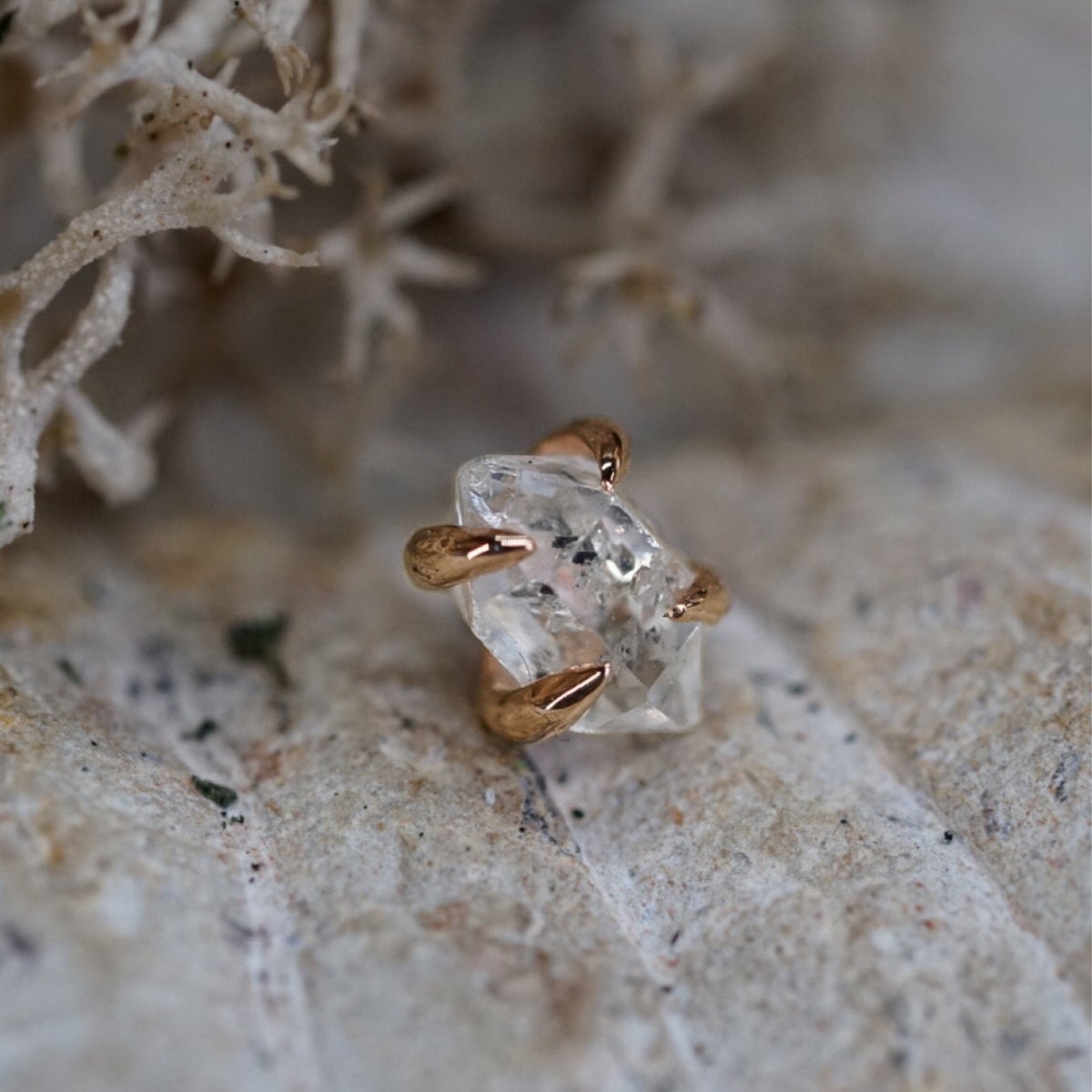
Make Me Holey is a prestigious luxury body jewelry and piercing studio located in San Jose, California. Renowned for their exquisite jewelry collection and exceptional piercing services, Make Me Holey aimed to enhance their online presence and offer an unparalleled user experience on their website to attract a wider audience and increase customer engagement.
Challenges:
-
Mobile Responsiveness: The client's existing website was not optimized for mobile devices, resulting in a less-than-ideal experience for mobile users and limiting their reach to potential customers on smartphones and tablets.
-
Customer Communication: Make Me Holey was inundated with a high volume of customer calls and emails seeking information about their services and products. The lack of easily accessible information contributed to an increased support overhead.
-
Image Optimization and Loading Times: Unoptimized images on the website led to slow loading times, negatively affecting search engine rankings and user experience.
-
Effective Lead Generation: The absence of strategically placed calls to action made it challenging for Make Me Holey to capture leads and convert website visitors into paying customers.
-
Organizing Shop-able Categories: The vast array of jewelry pieces made it difficult for visitors to find specific items on the website, leading to a disjointed browsing experience and potentially hindering sales.

Solutions:
-
MOBILE FRIENDLY REDESIGN
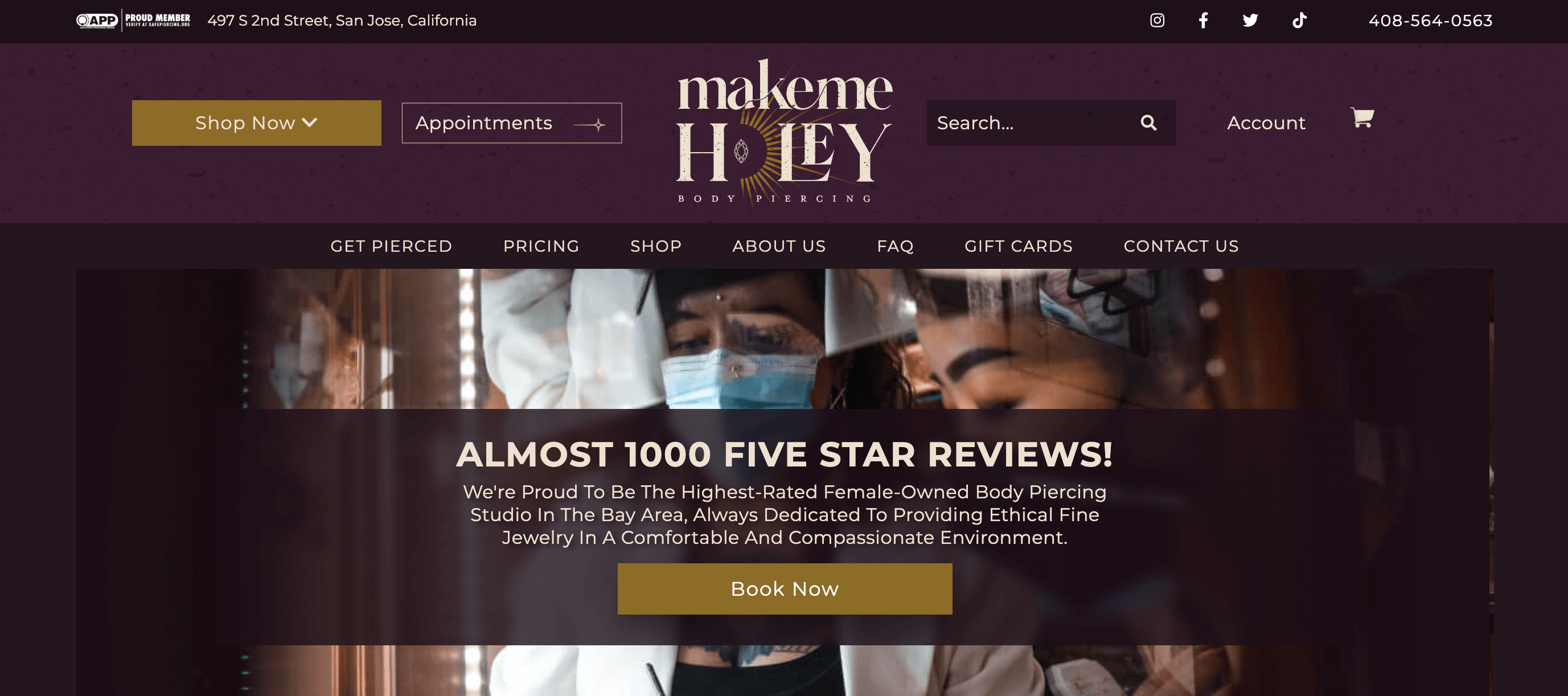
We conducted a comprehensive redesign of Make Me Holey's website, ensuring full mobile responsiveness. By employing the latest responsive design practices, the website now seamlessly adapts to any screen size, catering to mobile users and providing an optimal user experience. INFORMATIVE FAQ'S PAGE
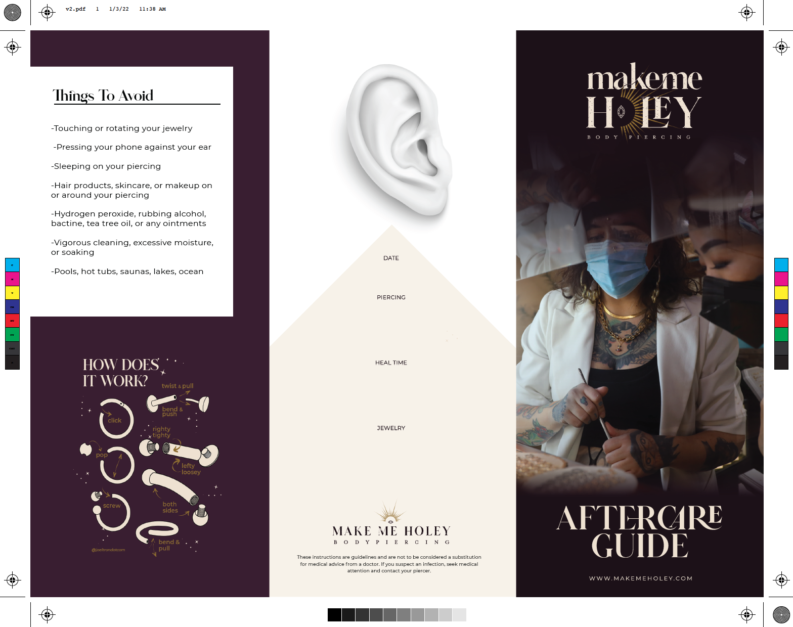
To reduce customer inquiries and enhance communication, we developed a comprehensive Frequently Asked Questions (FAQs) page. It contained detailed information in the form of keywords about the studio's services, aftercare instructions, and product specifications. This informative resource empowered customers with essential information, thereby significantly reducing the volume of support calls and emails.IMAGE OPTIMIZATION
I conducted a thorough image optimization process. All images on the website were expertly compressed, labeled with appropriate alt tags, and optimized for search engines. This enhancement resulted in faster loading times, improved SEO rankings, and a visually engaging experience for visitors.CALL TO ACTION PLACEMENT
I analyzed user behavior and engagement patterns on the website. Based on these insights, they strategically placed prominent and compelling calls to action throughout the site. By making it easy for visitors to schedule appointments, make inquiries, and explore products, the website effectively generated more leads and increased conversion rates.ORGANIZED SHOP-ABLE CATEGORIES
I restructured the website's product pages to create well-organized shop-able categories. By categorizing jewelry pieces based on type, material, and style, visitors could easily find specific items of interest. Intuitive navigation and filter options enhanced the overall browsing experience, leading to higher customer satisfaction and increased sales.

The collaboration between Make Me Holey and West Coast Website resulted in a remarkable transformation of the luxury body jewelry and piercing studio's digital experience. By addressing a diverse set of challenges and implementing thoughtful strategies, the studio witnessed significant improvements in website performance, user engagement, and customer conversion.
The success of this project exemplifies the powerful impact of effective web design and branding in elevating a luxury brand's online presence and driving business growth in the highly competitive market of body jewelry and piercing services.

